Exercise 1: Project Brief
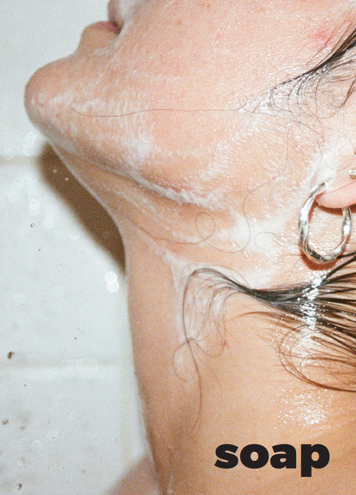
Last semester I designed and printed the very first issue of a zine. The zine is called soap.
Here are some photos:
(Not so brief)-Brief:
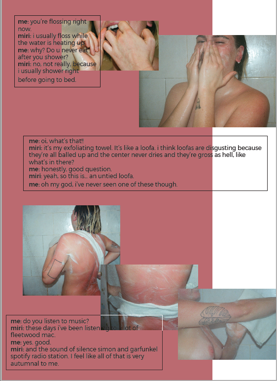
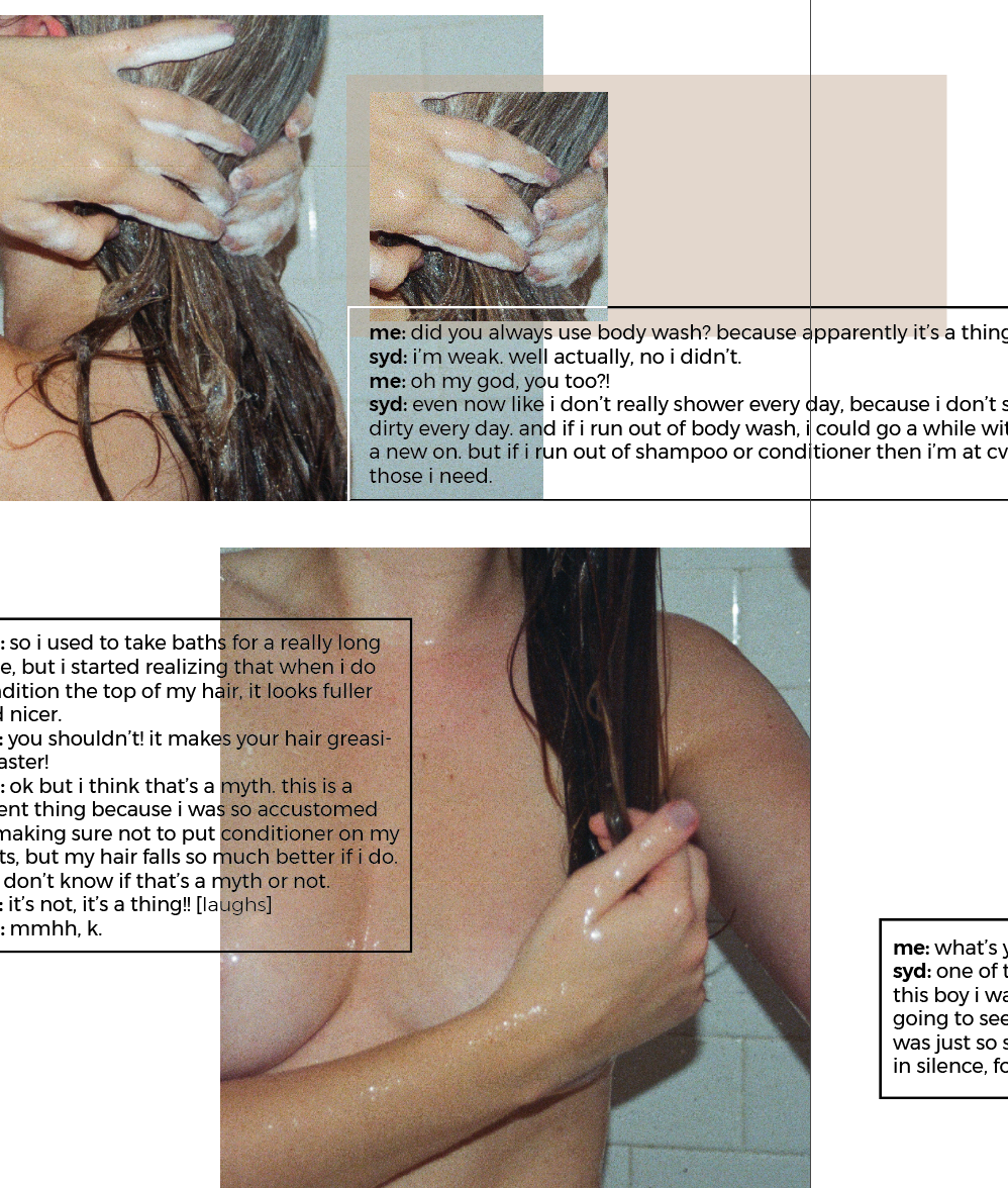
soap is a zine that documents my friends’ showering routines through a series of photos and bits of conversation between us. showering is personally one of my favorite things to do and i’ve recently realized how specific and particular my routine is to my friends’. soap came about by wanting to highlight the discovery of our differences and similarities in showering, and embracing the unique quirks, loosely inspire by this ITG story. it’s about my friends, for my friends. soap is an embodiment of our friendships and dynamics.
soap includes three of my friends. the front cover begins from the top [head] and the back cover ends with the bottom [toes]. inside is my editor’s letter and their three stories. no conventional masthead, everything is done by me and my friends know that. montserrat is used all throughout as the only type for a clean design and an easy read, as it isn’t copy heavy. unedited film photos superposed and laid out randomly within stories across spreads, to emphasize the raw aspect of naked bodies in that experience as well as the spontaneous and natural flow of the conversation. it follows a 12-column grid to allow for layout freedom, as within each story there is no timeline or order in which sections need to be read. the blocks of color were chosen to bring forth elements within the photographs that describe and emphasize their individual story and routine. printed on milkweed 32lb paper for a nice tint and texture, thick enough to sustain basic wear and tear, with a classic rubber band for binding. this allows for the zine to be taken apart, hung as individual posters and put back together.
- Published in May 2018
- Distributed at 374 Hart St.